Skinnytaste > Cookbook > The Skinnytaste Cookbook: Cover Designs (Help Me Choose!)

The Skinnytaste Cookbook: Cover Designs (Help Me Choose!)

This post may contain affiliate links. Read my disclosure policy.

After a year of recipe testing, manuscript writing, editing, photo shoots, and everything else that goes into writing a cookbook (and let me tell ya, there is a lot!), I’m SO excited to share three cover designs that (fingers-crossed!) I hope you like as much as I do. But I need your help—I can’t decide which one I like best, so I thought it would be fun to let YOU decide!

The Skinnytaste Cookbook Cover Designs

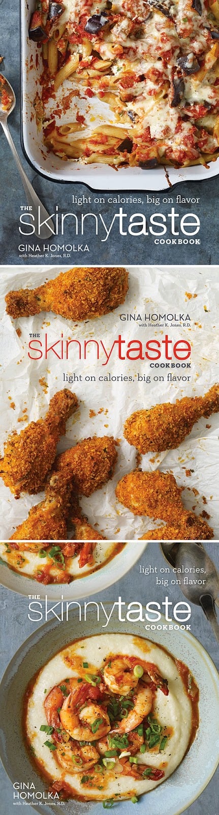
The design team at Clarkson Potter worked really hard to come up with a cover that would stand out on the shelves. We narrowed it down to three, all photographed by the very talented Penny De Los Santos.

The three recipes pictured on these covers are:

A) Cheesy Baked Penne with Eggplant
B) Buttermilk Oven “Fried” Chicken
C) Kiss My (Shrimp and) Grits

Please help me choose by telling me which you like best: A, B or C in your comments (please don’t email me)!

And if you haven’t already done so, be sure to sign up for The Skinnytaste Cookbook newsletter. That way you’ll be the first to receive recipes, special offers, and lots more about the book!

Comments are now closed,… Thanks for all your helpful input.

Rate and review this recipe!

Your email address will not be published. Required fields are marked *

3,731 comments on “The Skinnytaste Cookbook: Cover Designs (Help Me Choose!)”

  1. I love your recipes! Ive lost 40 lbs with your recipes and weight watchers…(and Im vegetarian! I just substitute vegetarian options for the meat) but the cookbooks, B catches my eye first and gives the impression of traditional simple comfort food with its layout and contrast…I’m a busy person and want simple and fast……A implies that you can eat light and still have pasta(generally a ” no no” in diet world) but it does imply more complicated as well but I think the pasta doesn’t look very appealing in this photo. C looks exotic and freshbut makes me think complicated and time consuming.

  2. I really like both B and C. B is fun and really pops out but C is much more sophisticated and looks delicious.

  3. A

    Because it doesn't look like"healthy" food and people will want to know more. It looks like delicious comfort food.

    C is too boring – it looks like every other cookbook out there. I don't like all the white on B.

    I think A is definitely the best choice.

  4. Sorry, but none of the above! Gina, you have taken such amazing pics of your food creations in the past….these photos are not YOU! Please consider using your own photos…one of my first Skinnytaste recipes that I was drawn to by your photo was: Chicken and Mushrooms in a Garlic Wine Sauce…amazing recipe which I have shared so many times….please consider this one: https://lh6.googleusercontent.com/_BizpeaUzxq8/TYoMl-zgITI/AAAAAAAAC5w/Ho_-B1ErrKo/s800/low-fat-chicken-mushrooms-white-wine-sauce.jpg

  5. There are so many other pics in your blog that would be so much better than these. The food needs to have that colourful splash that we are used to from you! None of these dishes look fresh and nutritious. Disappointed.

  6. Personally I find A too messy. Visually B is very nice; it's crisp, clear and neat and I love the colors! but since I would not cook Fried chicken I wouldn't pick it up. My hand would automatically go to your book with cover C because of the type of food in the photo! 🙂 thinking SkinnyTaste and shrimps?! YES! Good luck with choosing a cover and Congratulations! I love your recipes!!!!

  7. Avatar photo
    Alexis Bennett

    B! Because I've made this recipe several times and its SO good 🙂 Excited for you, congrats!

  8. I really like B because it also makes us think that we can also have eat like everyone else but without all the extra fat and calories! Good luck with your cookbook can't wait to buy it!!!!

  9. C is my favorite…good southern comfort food! I can't wait to read your book! Thank you for the opportunity to vote!

  10. A. I think C looks great but people like I who don't enjoy seafood would be turned off. I feel like so many "skinny" cookbooks focus on seafood, so I'd rather go for a book that has a hearty, messy casserole on the front!

  11. As someone who actually knows design/composition etc, definitely B. B pops with colour, it's colour scheme is great, and composition is perfect, and the crumbs are playful.

    A is the second best, the blue background really makes the cover stand out.

    C is the weakest, I wouldn't pick it up in a bookstore. Whilst it is "cleaner" the the other two", the composition is the weakest, and it doesn't look as lively as the other two.

  12. Kinda bummed by all of them…no offense. I love your site and your recipes but A and B look messy (even a dirty spoon in A!). C is definitely something I would make but is probably less appealing to the masses. So I would go with C by default. If A and B didn't look dirty I would vote for those foods!

  13. C! I love everything about it. The picture is the most appealing to me, and the text looks the most organized. So happy for you, Gina!

  14. I'd go with A because you can tell B is breadcrumbs and baked (so not 'real' fried chicken), and C 'looks' too complicated. When people shop for delicious low-calorie food, they want to know they can still have their comforting favorites – pasta smothered with cheese is just that! Also, it looks like A was so good that the photographer had to help himself before shooting the picture. The other two don't!

  15. A. the background is soothing to the eye..and I like that the food has so obviously been dived into! 🙂 shows your food is really great!

  16. B definitely. It will make people stop and be like "wuuuutttt? but that's fried chicken? I gotta take a look at this book!"

  17. Hi! I LOOOVE your recipes. Thank you for sharing so many of them. I would go with "B" because I just love fried chicken haha!

  18. B all the way! A- looks eh, and C- looks like it should reallly be inside a magazine….and not the cover of a book to me.

  19. C looks most appealing, although they all taste delicious if I were to see C in the bookstore or online I would be most interested in picking up the book and reading the recipes.

  20. A is too messy and therefore not appealing. On my screen, the white background behind the chicken in B looks like a plastic bag. I love seafood, but lots of people don't, so I wouldn't do C as it might turn off a potential buyer. Have you considered something from your own website? You have some great images–ones I like far more than the 3 options given here. congrats! I love your recipes!!!

  21. Avatar photo
    Elizabeth King

    In my anonymous comment I said I liked A but on rechecking each cover I think I prefer C even though I am not sure about grits!

  22. I like the looks of A although C is very nice as well. The problem with C is I don't think I like grits even though the picture is enticing!

  23. I like A and C the best but can't decide because A is something I'd actually make but C is prettier…

  24. C) Kiss My (Shrimp and) Grits ….. I am a graphic designer and this one is definitely the most appealing. 🙂

  25. Avatar photo
    Stephanie Khio

    All are great, but I think B fits your style of cooking more than the others. It's fun and versatile, and it most likely won't have dieters (who want to eat the same foods, just healthier) looking the other way. People will see the cover and say, "that could be skinny?!"

    Hope that helps!

  26. DEFINITELY A. The picture looks like simple, comfort food while the title tells you what's different about your recipes. If I'm looking for easy, delicious recipes, that's the one I'd grab. I look at both B & C and I immediately think the recipes are going to be complicated and not something I could do everyday.

  27. Avatar photo
    Samantha Trainer

    A! for sure! A lot of people think giving up pasta when trying to eat healthier is some kind of "rule". This image proves them wrong.

  28. B. A would be my second choice. C is too "composed" and dated for me in food styling and presentation. The simplicity of B is perfect, I just think it needs to be re-shot and it will be perfect.

  29. Avatar photo
    Anna Wienert

    Definitely A. I love skinnytaste because it's everyone's dream to eat pasta and cheese and it be low cal and good for you. B I find too plain and C is too perfect and looks too healthy haha.

  30. C – is pretty, classy. I don't like A because it looks messy and unprofessional looking. I don't think B really represents your recipes. I LOVE YOUR RECIPES!!

  31. C looks the most appetizing and the prettiest of them all – it's my first choice. B really pops color wise though

  32. C. I agree with those who said A looks messy, and B is just chicken drumsticks, yes everyone loves fried chicken, but it is so normal. C is special, when ever we have shrimp and large one to boot!, we are having a meal that is not considered everyday, it is a treat and to be savored. so c gets my vote, hands down!

  33. I'm not crazy about any of them. I love pasta, but Cover A looks messy, like something I would make at home (and I'm not much of a cook). An elegant plate of pasta would have been good. Cover B also looks messy. Cover C looks elegant, but I don't eat seafood. A cover that included ALL those dishes (in a neat, clean presentation) somehow would have been ideal.

  34. C is the neatest, although I might not be drawn to notice the book with grits on the front, since I personally don't eat that food. A is messy, not appealing, but would be great if not already dug into. B would be super if photo retaken with chicken on a plate with a vegie and rice/potato; a complete meal from your collection. Your photos always look amazing, I agree with another fan that these photos aren't as nice as you usually show. I'm very excited about your cookbook coming out soon–congratulations!

  35. A. I really like the neat look of C, but I wouldn't be drawn to buy the cookbook with grits on the front, because I don't like/eat that. B would be great if placed on a plate with vegies near. Therefore, I choose A, since I would be drawn to buy it to make that recipe. (Not thrilled with the messy look though.)
    Your best bet is to retake the photo with chicken on a plate with vegies and a potato/rice on it(a complete meal) and your cute gingham napkins near by.

  36. C, but like others they all look delicious. I have over 250 cookbooks, and I always go for the covers that are plated neatly. Best of luck and I have to say, you have saved me several times now from going over my points value with your wonderful recipes. Still lowering the numbers on the scale, thanks.

  37. C is clean and professional looking and I like the layout of the copy on that one because it is not all crunched together.

  38. A or C.
    B is boring and looks like there should be more present. I would personally love to eat A. It looks delicious! I don't like shrimp but C looks divine.

  39. I know I am late to the discussion but I think a looks like a lot of other cookbooks out there and b looks awesome but I would probably steer away because it looks like your book is going to be all messy foods, so I would go with c because it looks the most delicious and useful!

  40. Avatar photo
    Cat Davis - Food Family and Finds

    The chicken would make me buy that cookbook in a hot second, I'd skip over it with the other covers.

  41. C, I think it looks the best. A looks messy and B looks unhealthy. I know the cookbook is healthy versions, but having something that looks fried just seems contradictory.

    Congratulations on the book – can't wait to see it!!

  42. Definitely B because it looks good AND it emphasizes that you can still eat comfort foods while eating skinny!

  43. I choose A. It looks like easy comfort food — something I could make. It's not intimidating. Also, the title of the book is more eye-catching.

  44. I am not a fan of any, considering you have so many beautiful photos I am surprised these were the three top choices.
    I completely agree with CKGeary's comment above.

  45. I really like C the best. It attracts me the most, but I already can't wait for it to hit the shelves!

  46. C. Because, honestly, pictures of something that looks half eaten or messy is a huge turn-off when I'm looking for recipes. I skip right past them without reading the recipe very often because of this.

  47. B
    I've thought about this for several days and the "fried" chicken keeps coming to the top of my list! Yum! Can't wait to get a copy of your cookbook!!

  48. Being a vegetarian, I'd prefer A. Not sure if it has meat in it or not, but at least it looks like something I could likely make meatless. And the idea of making pasta healthy is appealing too!

  49. A – because I think it catches the eye and, as an artist, is a nice balance of light and dark colors, while flowing with the eye. But any of them would work great.

  50. I would buy a cookbook I have never heard if the cover was C. The dish looks impressive and how could it be light on calories too?

  51. C, it's the one I find most aesthetically pleasing as a cover. But all three are delicious! 🙂

  52. Definitely not A! 1) It looks sloppy and 2) I have seen way too many cookbooks with that same type of cover. It looks like just another cookbook.

    B looks unappealing. If I wasn't familiar with your recipes, I would not buy your cookbook based on that picture. I think you have a huge fan base online and we all will like buy your book, but what about others who have never heard of this site? Without being familiar with the author, I would never believe baked fried chicken would be good & light.

    C is the cleanest looking cover and of all 3, I would choose that one.

    Although I don't think any of them really do much justice to your recipes. None of them look really original or like something that would stand out.

  53. C is a great shot…this one is the cleanest of the designs…very nice. And this one would catch my eye first. Congratulations on the cookbook. Well deserved!

  54. I would go for A !

    But if we could change the picture. I would choose B and change it to show it as a complete meal.

  55. C, it's the most visually appealing, although a font colour other than white might make the text stand out a little more. If A was a complete pan I would have chosen that, but I don't like that it's a picture of half-eaten leftovers. B is a little too bland due to the mainly white background.

  56. Hi Gina. I LOVE your recipes and your food. Your contribution to healthy cooking is monumental, especially as you have married WW with the most delicious recipes. That being said, YOU are the best representation of your cookbook–a confident, beautiful, healthy and glowing woman who is contributing positively to the world. YOU are the inspiration, the creative force behind your blog, and as a result, your cookbook. YOU are your own brand, and I very strongly believe that YOU should be on the cover of your book, maybe prepping some gorgeous fresh fruits/vegetables. I cannot imagine anything more appealing and appropriate for this project. YOU are SkinnyTaste. p.s. Congratulations on your successes, you have earned every last one of them. You are an inspiration!

  57. Definitely C, it's not too messy or oversimplified. And it looks Ah-mazing! I would buy a cookbook with that on the cover.

  58. I would definitely pick "A". B is bare and C looks like a few shrimp on a bowl of cream of wheat! Not appealing.

  59. Definitely C, hands down. The pasta dish looks like someone's leftovers, and fried chicken doesn't scream skinny or healthy to me, so neither one of those covers would make me buy the book. The shrimp dish is visuually appealing, looks light, fresh, and low-cal, and is the only one of the three I would consider making. Congrats on the book!

  60. gina i love ya but i dont like any of them. you have so many other beautiful pictures; these do not do you justice! A is bad because the piece is missing out of the dish, the crumbs in B look weird, and C is eh because not everyone likes seafood.

  61. Avatar photo
    Heidi Hoerman

    B, the "fried" chicken draws you in to the book. You are inspired to pick up the book and look inside for how to make fried chicken that fits the subtitle of the book.

  62. B. Everyone wants to eat healthy, but we also want our comfort foods. I don't care for A as it looks messy and C is okay as my second option.

  63. Avatar photo
    Carol Mitchell

    Cover B would be your best choice. My reasons. Cover A looks like a dirty dish that is ready to be scrapped. Cover C looks like a cover you have seen a million times before. Cover B is simplicity at it's best. Cover B represents all that you want to convey to the public…..your name, the name of the cookbook and what the recipes in the book represent. As far as the crumbs on the cover, I am a southern grandma and you can't have fried chicken without the crumbs!

  64. A!!!
    A is super appealing to a wide audience, in my opinion. Gives me the impression there would be a lot of yummy recipes I would be able to make. C, although "pretty" gives me an impression of more time consuming or gourmet-ish which translates to less of my pickier little eaters recipes.

  65. A or B. C is nicely presented but I feel it's too generic. Many cookbooks feature these perfect, neat dishes, so A or B will definitely stand out among them. The first two photos say, "You can indulge in this comfort food without all the calories!" I like the contrast of the gray blue to the white in the first photo and the white font color, but the scattered chicken on a white page also shows great contrast. (And who doesn't love crispy chicken!?) Also, the first picture gives me the feeling of family meals and togetherness (hehe maybe because of the portion and casserole dish).

  66. A. Pasta always seem to good to "skinny"
    It looks best for weight watching cookbook. …. Cant wait

  67. C- just because I wanted to make it and eat it just by looking at that cover. Congrats on the cookbook, I can't wait to get my copy!

  68. Avatar photo
    Heather Lloyd

    A! I am just attracted to the colors, etc. Plus I think people would want to find out how you made that cheesy, carby dish low cal!

  69. Avatar photo
    Patricia Joy

    C. Attractive, composed, look delicious. A & B are messy and not appealing to me for cover.

  70. Avatar photo
    Marie~Claire

    I like B….The name Skinnytaste and fried chicken on the cover would certainly attract my attention!! How could fried chicken be "skinny". Love all your work Gina…good luck and I will most def buy this cookbook!!!

  71. C! A would be great if on a plate, but it's too messy with some out of the pan. B just screams "fried" which does not relate to the theme of the book! Congrats! Jacki

  72. A or B. They all look amazingly tasty, but I think the thing that makes you stand out among other health-recipe bloggers is that most of your recipes are healthy versions of dishes that are commonly seen as UNHEALTHY. Covers A and B show that feature off nicely (shrimp and grits aren't necessarily seen as healthy, but many people do see seafood as healthy no matter what, as opposed to pasta or fried chicken).

  73. I love C.

    Unfortunately A makes me uncomfortable because of the messy dish and utensil. The last thing I want to be thinking about when planning a meal is having to do the dishes.

  74. B is my vote as well. I like the layout of it best. It also pops and stands out to me more than the others

  75. C I think it exemplifies your unique style…. and taking those tempting foods and making them guilt free… Kind a like "having your cake and eating it to!" 🙂

  76. Avatar photo
    violarulz/ducksandbooks

    A, because it's the only one of those 3 I'd eat (the others couldn't be made Kosher)

  77. C- its really represent your book; neat, really light in calories but full of flavors. Congrats btw!

  78. Another vote for B. A looks like something almost anyone could throw together, but skinny "fried" chicken has that aspirational touch that would lead my to buy the cookbook. Good luck and congratulations on your well-deserved success!

  79. I like C the best. I do like the concept of B showing how you create healthy meals from fattening favorites, but I think people will buy it based on eye appeal first and foremost. I am personally not appealed towards a picture of chicken. That being said, I will buy this book regardless of the cover because I love your recipes! 🙂

  80. Avatar photo
    Katherine Ross

    A is timeless and sophisticated, appeals to vegetarians and carnivores, and really pops with that light/dark contrast!

  81. C – I think the dish in A looks messy and unappetizing. I don't mind B, but C is much more appealing and intriguing. Looks delish as well!!

  82. I think A! It appeals most to families. something for everyone, not just mom. But, C is good too 🙂

  83. B – If people recognize a "skinny" way to cook fried chicken, they'll pick up that book to look inside!

  84. C, it looks fancy but like something I can make myself. If I saw fried chicken on the cover, I'd dismiss it right away as unhealthy without even reading the title. And the lasagna look delicious but messy.

  85. C. I like A, but many won't be able to get over the messiness / missing spoonful. Although I love fried chicken, B looks to sparse. C is most appealing overall.

  86. Compliments to the Clarkson Potter team – you have three great choices.
    I would say your choice boils down to what message you want to send.

    A. Just looks comforting and downright delicious. If you want readers to feel like these are approachable recipes they and their families will love, then this is your choice.

    B. This one is just good minimalist design. The pop of red on the white background will catch the eye of a hungry soul perusing the shelves at the local bookstore.

    C. This one speaks more the uniqueness of your recipes. Like option B, it will set you apart a bit from the other covers on the shelves but it also says a little more about what makes your cookbook the one a reader should want to take home. As a Visual Team manager for a national magazine, an unabashed cookbook junkie and a big fan of your blog, this one would be my choice.

  87. To be brutally honest, I would start over. A is too busy with colors and there's something not appealing about it being partially eaten. B just looks like chicken dropped on wrinkled paper. Too much white space. C looks a little better, but I'm unsure if grits is the most appealing food to see on a book cover. While all of the dishes are something that I would make, I'm just not sure it's eye-catching on a book shelf or website. I've seen better pictures of yours associated with your recipes. C probably has the best background if you took out the grits. Just my opinion – not trying to be harsh, but be honest.

  88. Avatar photo
    Kimberly Pinkiewicz

    B – skinnytaste stands out more. BUT I do like the picture in C better…if you can just change the color of skinnytaste to stand out more on C then that would be my choice. You want the name to pop out at you.

  89. C – it looks more appetizing because there is more color in the food. I will buy the cookbook regardless though!

  90. B or C. I think A looks messy. B relates to simplicity, but looks delicious. C looks more gourmet and like a complicated recipe, even though those of us who follow you know you're recipes are simple but delicious.

  91. I think C is the most visual appealing. A would be the one that I would want to cook though. 🙂 So I would choose C.

  92. C. The photo of the shrimp and grits makes me want to grab the recipe and make it right now. Yummy.

  93. Avatar photo
    Frank Mosher

    The emphasis in your excellent blog, is how to make good recipes, more healthy – AND YOU HAVE! Yet you are considering three recipes for your cover as follows:

    A "pasta" recipe
    An "apparent to the viewer" fried chicken recipe
    A shrimp & "grits" recipe

    After many years in Marketing and Marketing Consulting, lots of Food Product projects, I want to respectfully suggest the following:

    #1. Get rid of your present design consultants
    #2. Bear in mind that the rate of obesity in North America is out of control, (and the accompanying rates of Type 2 Diabetes, Heart Disease as well) and for the most part, your blog has most always tried to counter same with more-healthy recipes!
    All three covers at "first glance", suggest otherwise- AND, as such, are not in tune with the relatively new "North American" PUSH for healthy eating!

    At no cost, and with written exemption from any copy write claims, I could search through your recipes (most of which I already have used/saved- personal use only) and come up with better, easily! Give this to your design team. It's not just about cover design of attractive glossy covers-although a huge part-but the new interest/appeal, and thus Sales, which I respectfully submit will go nowhere with any of these three designs. i.e. pasta/grits/and what looks like "fried chicken" ! Have another look at it. Best regards

  94. I like B the most…
    I find A to be too messy looking and I don't like shrimp so C is not very appetizing to me. I feel that the Fried Chicken relates to more people and it's not something one would expect to see in a low calorie cookbook.

  95. I prefer C – It looks the most appetizing and composed. I like B but it doesn't include any food groups besides protein/meat and one of the things I like most about you and your website is how you are able to incorporate so many types of foods into a healthy diet and I just don't feel that B features that. A is not as clean-looking and is pasta – which I know so many people love pasta – but I find that is one of the foods I have the least amount of trouble cooking. C makes me want the recipe.

  96. I like B because it reminds me that I can still eat "fried" foods yet C is elegant and appeals to my love of Southern Home Cooking.

  97. C its the cleanest composition to my eye. Cant wait for your book. I have tried many of your recipes and have loved them all. Congrats on the book!

  98. I'm torn between A and C but I'd buy it no matter what was on the cover. I LOVE your recipes and can't wait to get my hands on the book!!

  99. B!

    A: not quite appealing
    B: healthy fried chicken….ohhhh yess
    C: over the top meal and might lead you to imagine that the receipes are hard to make them yourself for everyday meals.

  100. C. This dish has the most professional and appealing look. I totally agree with the comments that say A is messy looking and not a cover and B lacks "Buy Me" appeal.